Voting compasses
A questionnaire that tells a voter, in three minutes, how close they are to each candidate. And tells you, in return, what the electorate actually looks like.
In short
- Languages
- Romanian, English
- Delivered so far
- 4 platforms
- Build
- In house, end to end
What it includes
Item design
The matching algorithm
The live platform
The closing report
A good compass shows in the items, not in the design
The interface is the visible part. The part that decides whether the result means anything is the few dozen statements behind it: how they are worded, which dimensions they cover, and how easily they can be accused of bias.
We work backwards from an agency. We start from the literature and the candidates’ manifestos, write the statements, test them on a small group, cut whatever fails to differentiate — and only then draw the screens. The methodology is published with the instrument, so anyone can check where the percentage comes from.
If you cannot explain in public where the percentage comes from, you do not have a compass. You have a quiz.
Who it is for
Who asks us for a compass
Newsrooms
Civic NGOs
Research teams
Public institutions
Compasses delivered
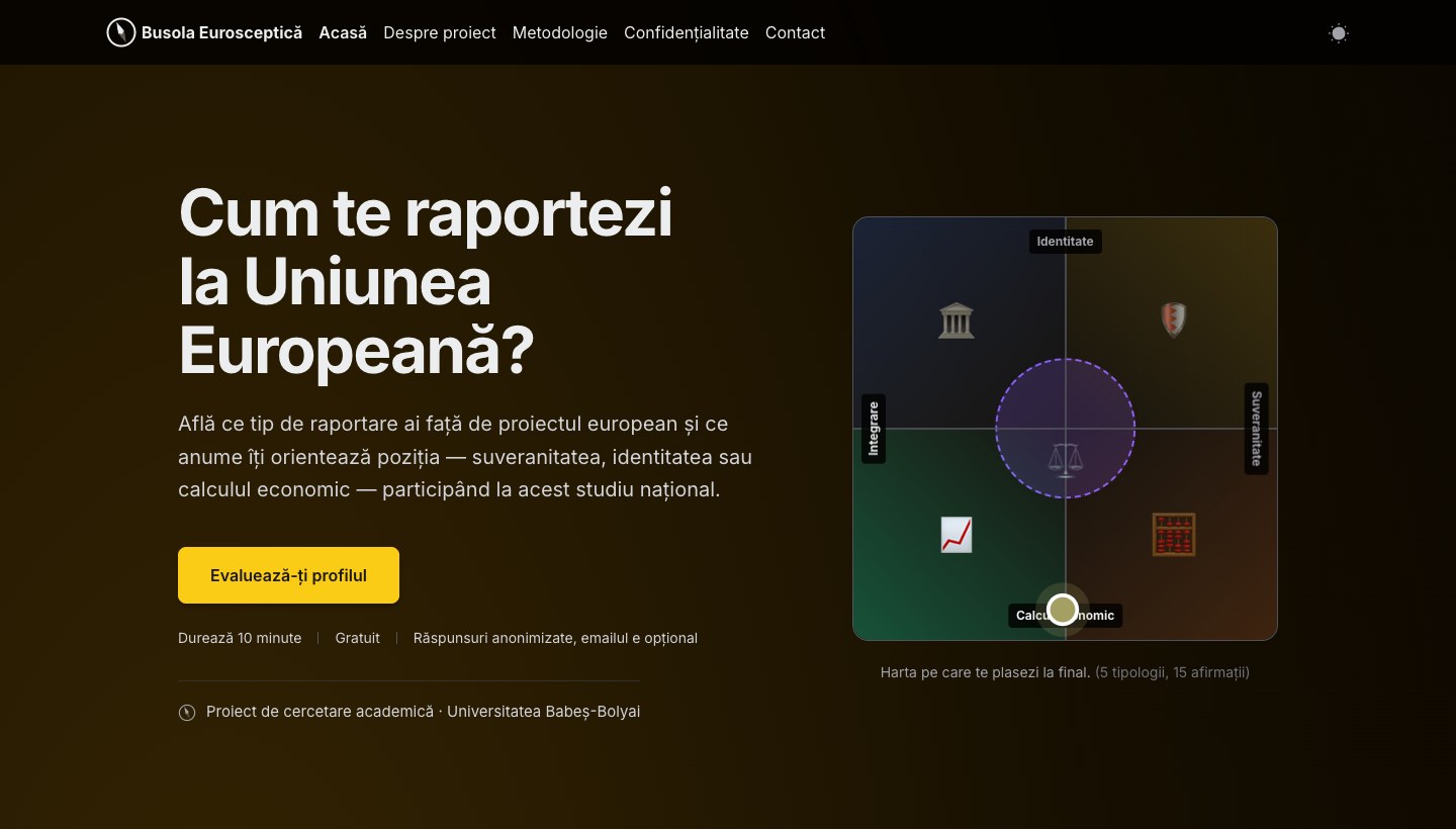
Busola Eurosceptică 2026
Busola Media's companion study: how you relate to the European Union, and why.
Read the case study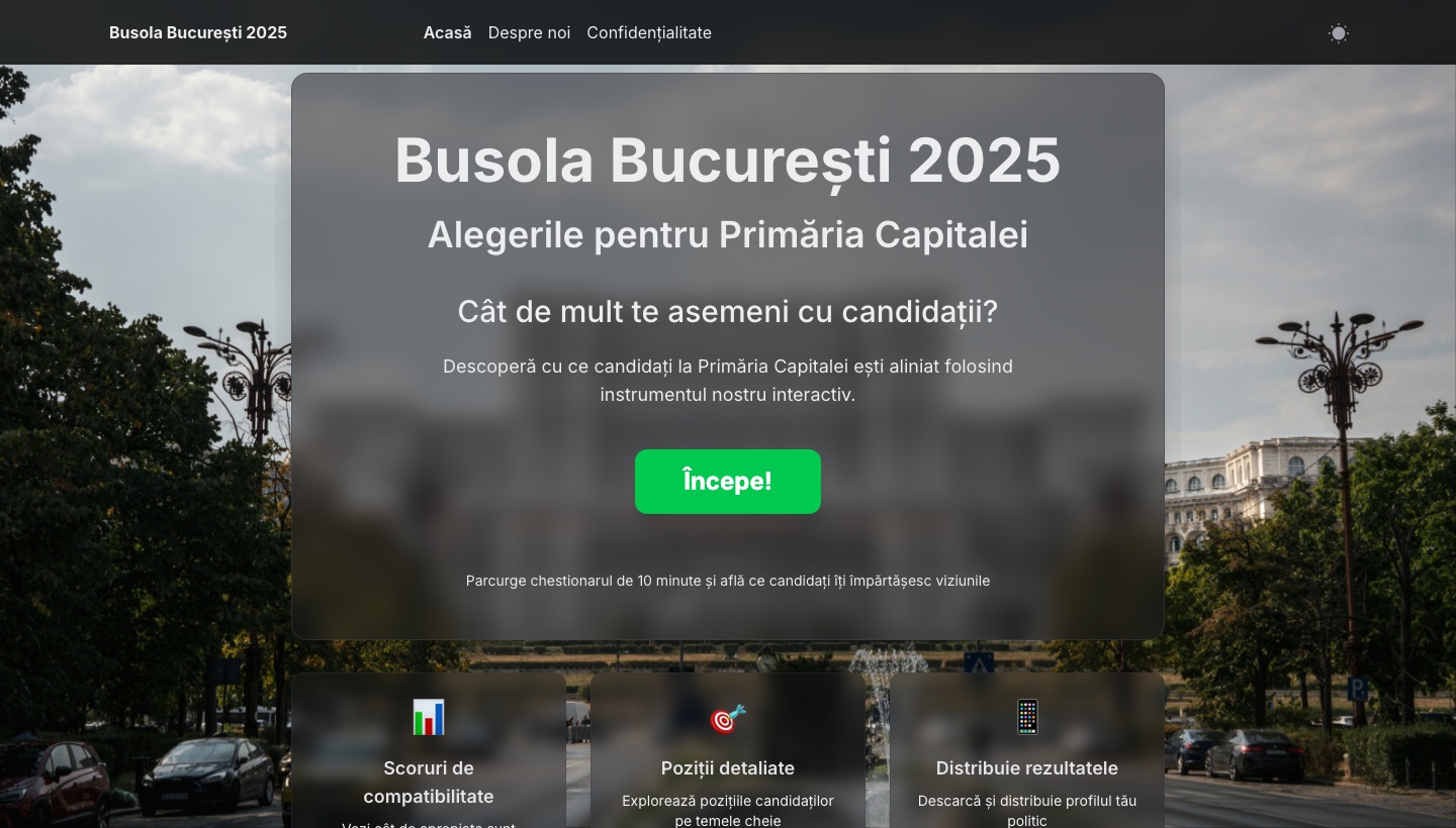
Busola București 2025
The voter's compass for the Bucharest mayoral race.
Read the case study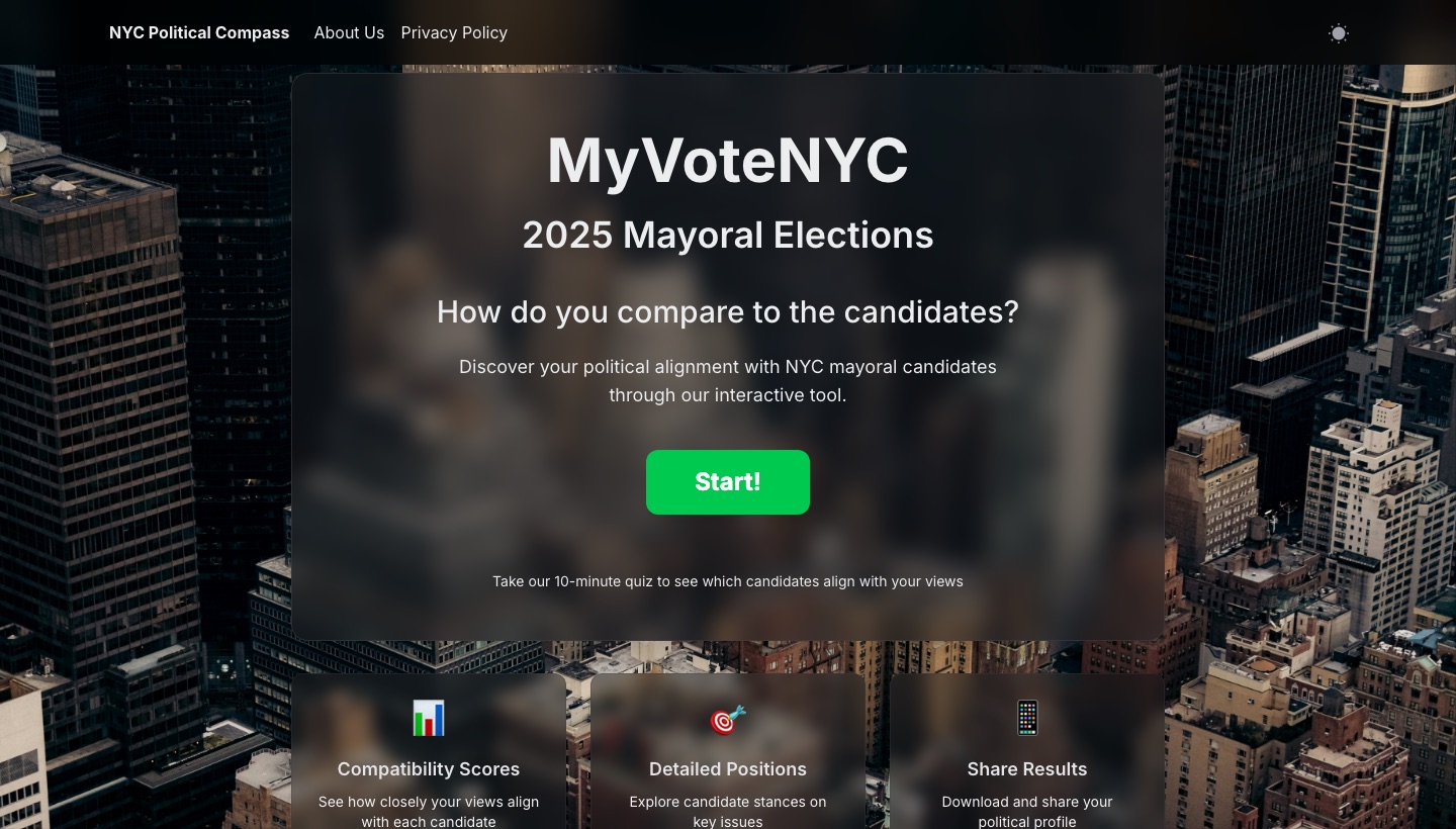
NYC Political Compass
The compass for the New York City mayoral race, in English.
Read the case study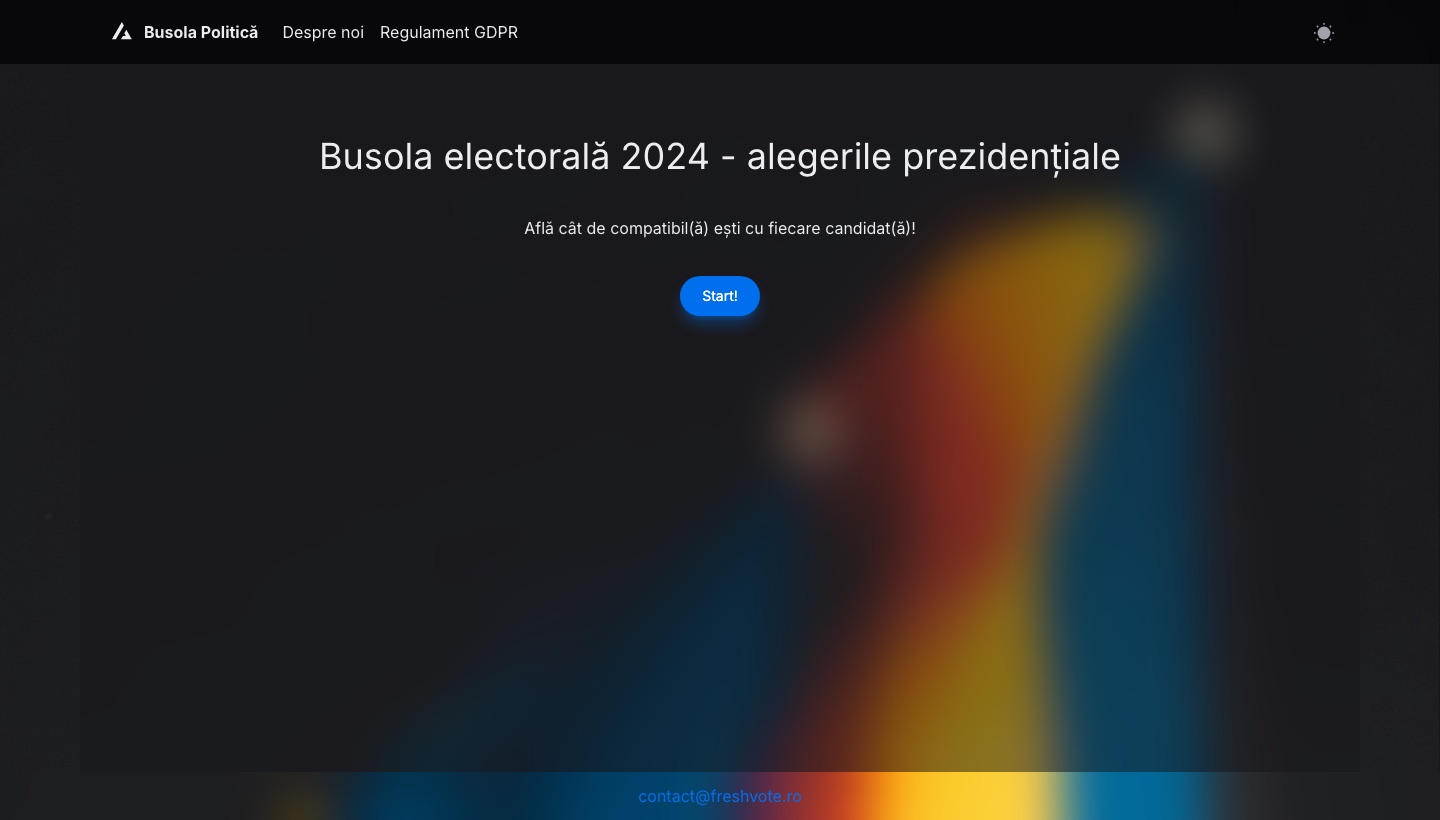
Busola Politică
The studio's first compass: the presidential election, built in 2024.
Read the case study